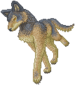
BettyxMe wrote:Wow, your sprites are very nice. I find that their shading is pretty dull though. It's low contrasted and only has one or two shades. I think you should add more in between shades and highlights and make the darkest shade, well, dark to give the overall sprite volume and oomph. :3
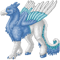
And since Zhar-ptitsas are very bright colored, I think you should make the lightest highlight very bright. Not just by moving the little color bar up, but maybe going a little green or a little purple on the brightest highlight for the blue one for contrast. Right now, I can't see any shading on the blue at all because of the close colors and low contrast.
Overall, I like your sprites a lot, and they have a lot of potential.
Thanks for councils)) I will try to make the future works better.
BettyxMe wrote: Wow, me too!!
ãфф... úðú-тþ ÑÂтрðýýþ ÿøÑÂðть тут ÿþ-руÑÂÑÂúø ÃÂð ÑÂðüþü ôõûõ ÑÂþóûðÑÂýð Ñ BettyxMe- üþöõт üþöýþ ñыûþ ñы ôþñðòøть тõýõù, ýþ ÑÂтþ уöõ ýð ñуôущõõ Ñ…)) ð òþт ÑÂøýюю Öðр-ÿтøцу тþчýþ ÑÂтþøûþ ñы ÿþ-úþýтрðÑÂýõõ ÑÂôõûðть
àòþþñщõ Ѡþчõýь-þчõýь ûюñûю тòþø рøÑÂуýúø, òÿрþчõü, úðú ø üýþóøõ ÷ôõÑÂÑŒ ÿрøÑÂутÑÂтòующøõ
All in all i just agree with BettyxMe about shadows = ))
Wow, is this Russian?
Idk Russian, so I'll just say it in English.
I love your sprites!
They really do look nice.
The only thing you might improve on is the shading.
I bit more shading and contrast can make your already-awesome sprites totally awesometastical pwnageness.
I look forward to seeing future works!
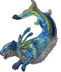
The blue Zhar-Ptitsas are cool! The yellow ones where lighter, so the details were clearer, but these ones are just... cool!
ongaku_itsumademo wrote:Wow, is this Russian?
Idk Russian, so I'll just say it in English.
I love your sprites!
They really do look nice.
The only thing you might improve on is the shading.
I bit more shading and contrast can make your already-awesome sprites totally awesometastical pwnageness.
I look forward to seeing future works!
Thank you very much! Now I have draw Ukrainian Zhar-ptitsa, phoenix of my native country
Then again, I like the color blue better than gold lol