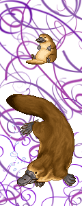
EDIT: Also- so if I fix up the shading a bit, would you guys be willing to buy them as pets? And for how much gold? 5,000-10,000g?
Thanks everyone for the nice and constructive comments!!!

NeamaWolf wrote:Very nice : D
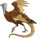
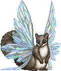
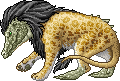
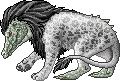
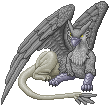
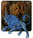
The gryphon looks pretty good, but if you want my 2 cents of input, I'd agree with everyone else about the shading and texture on it. Don't be afraid to make your shadows darker and your highlights lighter, since right now it look pretty flat. Also when doing highlights, I wouldn't use white, I'd use something like yellow to make it pop out more. Try to avoid doing black and white values on a colored picture, it just flattens the image. You could use blue or purple for the shadows. The only possible exception is when doing a creature that is greyscaled, but even then you can use colors to make it pop out more. Blue is always a nice choice.
Well it is greyscale, and tbh I wanted to do just a flatish color first. (And to be honest I'm not the biggest fan of these gryphons.

) But maybe if I can force myself to look at them only a little more, and shade them more properly, it would be worth it. So I'll see.
NeamaWolf wrote:The wings also look a little bit funky, I think its because the middle is rather long and the ends are too short. But I'm not very experienced in drawing folded wings so my suggestion may be a little wrong

Keep up the good work!

As for the wing- I actually used a reference- somewhere on google. *shrug* and that's how it looked. I didn't want to bother with it too much not just cuz I'm not a fan of the piece and it hurts to look at it; but also because my non-referenced wings have always been difficult.
Otherwise- thank so much for the advice!! X D
I might try redrawing it entirely by drawing a first sketch on paper- where I'm much more at home and can do better sketchwork. X D


 [/url]