
Munin, I'm always happy about your critiques ^^Munin wrote:I´m not sure if what I will mention now is something you do on purpose so please ignore me if that is the case.
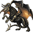
The shading on your sprites is kind of rough and busy looking in most cases. You have quite a low number of colours while your sprites are extremely large which leads to that look, as well as the dithering you use to smoothen out the transitions. If that rough look is not something you intended perhaps try working on a smaller scale or using more colours (also upping the contrast) to smoothen the shading somewhat and give the sprites more depth.
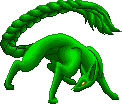
Also I would be careful not to rely on lines too much. For example the back leg of the dragon fish has a line in it to define the muscle...why not use shading to shape the muscle instead?
At least I think I made a big progress compared to my earlier sprites...
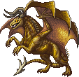
Well, the low colors are on purpose this time, as I try to make my sprites looking got, with less colors used.. ok, maybe The Dragon-koi could use another color on the scales (But it's my record! 10 colors.. without transparency, and it could look worse I think)... I had problem with it cause somehow my computer won't show the colors right in my program, they looked more pale and with less contrast as I wanted it
maybe the line on the leg was my computers fault, too, and I just forgot to delete it again, cause it looked fitting. It somehow things it should do lines for me, where I don't want them to be.
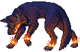
about the dither: most of the time, as on the bear-snake and the dog fish I used it to make it look kinda furry.. think I still fail on it