Akari wrote:Hi Munin! I might need a lot of advice on this sprite that I made recently:
yesiknowitsucksright
But anyway, I'd love to hear what you think about it.
It is not a bad start but certainly not done yet?
The lines are pretty smooth but I´d play with shading a bit, to better show off the texture of the leaves (?) and to make them look less flat. Where does the light come from? Are the wings stretched out absolutely horizontal or tilted upwardsa a little bit? Are they made from one piece or "layered" like a real butterfly´s wing? Those are things you show with the shading and that´d give your sprite a 3d-look that currently it lacks.
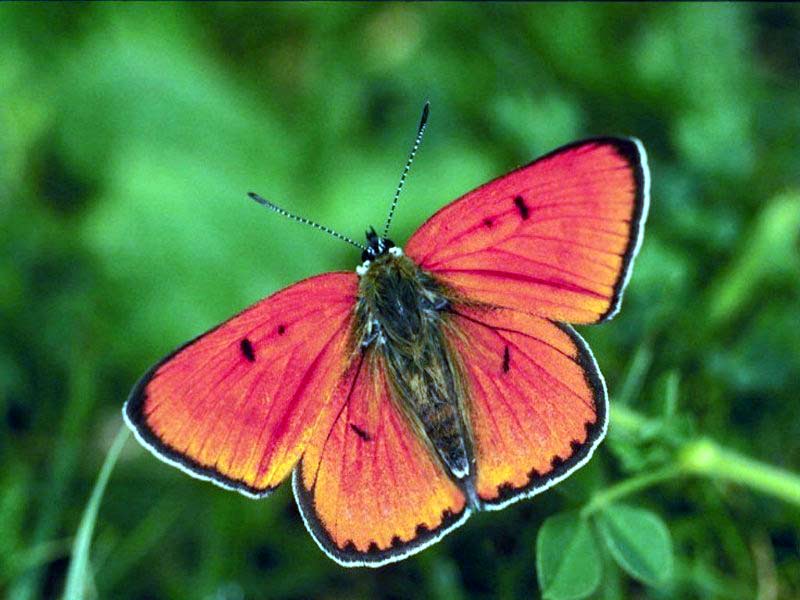
Certainly not done yet, I had just created the outline and filled in colors a little bit. And it's supposed to be a leaf dragonfly. I based it off this picture I found on the web (but I didn't have any idea that someone had that idea already, of course). Spoiler
I was thinking maybe my light source could be coming from the top left, and the wings are stretched out absolutely horizontal. However, I don't really understand the "layered" part - please elaborate?
Oh, the layered bit doesn´t apply if that´s your ref, I thought it was supposed to be a butterfly (because of the rounded shape of the wings) and on their wings the top and bottom are separate and lie over each other like in this pic:Spoiler
As I said, the outlines look pretty good already. The only thing you might try to fiddle with is the flatline-ish bit at the top of the left wing. Top left sound like a good choice. I think I´d tilt the wings ever so slightly to make shading easier because you can use a bit more contrast.
Munin wrote:Oh, the layered bit doesn´t apply if that´s your ref, I thought it was supposed to be a butterfly (because of the rounded shape of the wings) and on their wings the top and bottom are separate and lie over each other like in this pic:Spoiler
As I said, the outlines look pretty good already. The only thing you might try to fiddle with is the flatline-ish bit at the top of the left wing. Top left sound like a good choice. I think I´d tilt the wings ever so slightly to make shading easier because you can use a bit more contrast.
Oh, I understand now, and I'm sure it doesn't.
Great, thanks Munin, I'll get to it ASAP. However, just one more question - which way should I tilt the wings, the left side down a little or the right?
I think I started spriting in 2009, so about 3 years ago. For inspiration...that´s a bit tricky. I haven´t had time to work on any projects of my own for a very long time. When I do I usually start out just doodling random stuff, a head, a paw, a wing and then add to that, combine the different doodles etc. And I love to collaborate with others because working with someone else ideas can be bounced back and forth, being added to, changing until you end up with something you on your own would never have even dreamed of.
I usually seem to sprite items and the few creatures I've made haven't been that great (though I like my tiny slug). My friend asked me to sprite a squid and I've decided to ask for some critique since I love reading what you say about other things.
It's not done yet and I think I've noticed a few things that I need to fix but I'm not sure. I seem to have the hardest time with the shading. When I shade I feel like I have no idea what I'm doing or how to do what I want to accomplish. *Probably rambled*
That looks quite good so far Jeccakat. You could up the contrast a little, right now the critter looks a tad washed out overall because you are missing really dark shadows that would make the other colours stand out more. There are a few places where the lines could to with a bit of smoothing (or where you´ve got to be careful not to make the colours close to the lines too close to the colour of the lines themselves as that makes them look thicker than they are), mainly on the raised tentacles (the right one also has a slight think-thick issue) and the right side of the head below that additional fin(?). I like how you did the texture/shading on the lower part and guess you will apply the same to the head?
Thank you, Munin! I'll go through and mess with the lines to smooth them and fix the thin-thick problem. I'll also get a darker color for the lines in darker areas and I'll try to get more contrast with the shadows.
I was having a hard time trying to figure out how to get the head to match the rest since it's a larger area and a bit harder to blend the colors I picked for the rest of the sprite since the transitions seem to stand out more. Do you think I should add a few more colors for that area or is there some other way to blend them while still matching the rest?