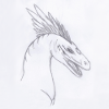
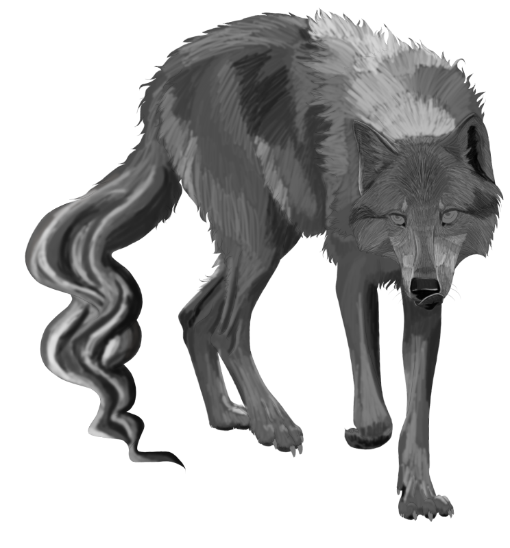
sparkpaw wrote:Hi Munin! I'm back for some more advice. :3
I'm working on making some pixel pets based on the epic new doni's. But I'm not very good with fur.... at least not semi-realistic or realistically.
So anyways, here's a wip. The face has had more work than the body, but you can still see generally where I am going with this.
Feel free to save the file and play with it or whatever you'd like. :3
I do like the lines the way they are, so I need help basically on getting the fur to look realistic. (And I am doing this in grayscale)
I have to agree with ML1201, a pixel pet is something quite different ;)
The anatomy looks good, no obvious things I´d see there. The fur on the head looks somewhat stiff, too orderly and regular. You´ve paid attention to the fur direction but the "areas" of different direction don´t blend into each other overly well and on the nose it is not correct (the hair is parallel to the nose but should be normal to it).
I am not sure if you plan on leaving the tail like that but the very distinct outline does not really fit the whispy, insubstantial look of the spectral wolves´tails in my eyes.
For the fur I´d recommend taking a look at GlassWalker´s sideart for the red panda or temple cat, her way of doing fur is great and very natural looking.
_______________
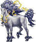
Ravenlore wrote:Hi Munin, I'm trying to make an outline for an ouroboros hatchling, and this is what I came up with so far.  /yesitsverybad

It really isn´t bad so far

I have to admit "hatchling" would not have been the first thing I´d thought though because it´s somewhat on the big side, how big is the adult sprite going to be?
The only thing that makes this critter look a bit odd (apart from the obvious oddness of the concept of an oroborous xD) is that the body has slight variations in thickness due to the way the upper and lower outline of the curve are arranged (it always gets thinner in the curved parts and the "straight" parts are thicker which you should be able to fix by just moving the lower outline down by one pixel in the curved parts). Also I´d have expected it to be a bit more snake-like and taper off a bit more severely towards the end. Or if you want to make it look like it has swallowed more than the very tip of the tail leave it at that thickness and have the jaws clamped around it fully instead of leaving a bit of air between upper jaw and tail.
_______________
WillowPuma wrote:Hi Munin!

Recently ive drawn this sort of dog thing...
But I think it looks too much like some sort of balloon.
There are several factors adding to the "balloonyness" of this little critter.
First of all the anatomy is a bit off, you´ve got very long, stiff legs attached to a really thin body. The legs are not of the same length and thus don´t end on the same plane so that it doesn´t look like the dog is standing on the ground. The shape of the paws adds to that as they are not formed like they are carrying any weight, the dog is just floating.
The neck gets too thin where the head attaches and the tail attaches somewhat too low on the body.
Another thing adding to the feeling that the dog is not a living creature ist the shading. You have pillowshaded the critter, meaning the light is coming from the viewer and hits always in the center of each body part making it look like the body is made up of stuffed pillows. Usually you want to avoid that, light coming from the direction of the viewer is unusual unless the viewer has a torchlight or is about to run the poor creature over. Stronger contrast would help make it more three-dimensional.
Here´s a (rather crude) example of how I´d change anatomy and shading (I didn´t change the whole tail, it would need some smoothing as well now that I look at it):
->

_______________
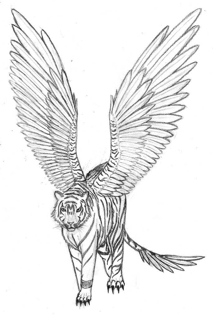
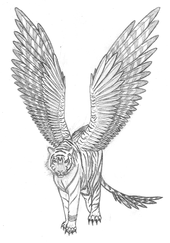
SilverDragoness wrote:I've been trying to make a reference sheet for someone, and I've only recently started. As I'm better with traditional style for initial drawing, I decided to colour and fix it later on computer, as the sheet has to be digital. But before I continue with the next step, could you please tell me about things I need to fix?
EDIT: I know feathers are layered in wrong direction, I fixed it, but can't scan it right now. I'm just a bit mad at myself - I started them drawing in the right direction and then thought that it's wrong. And then it took me twice as long as it would, as I'm not really good at drawing feathers like I did. And then to fix it ^^'
The tiger´s legs are a bit stiff looking. I know it is hard to show the joints in this perspective but just bending them a tiny little bit helps a lot. The left front leg (our point of view) does not seem to have a paw. Either it would be slightly visible in front or behind the other leg or the paw would be bent more if it didn´t have contatct to the ground. Right now with both far legs being off the ground the whole creature looks somewhat unbalanced, like it is going to topple over sideways. The paws are rather more delicate than a tiger´s usually are, if you look at references you´ll see that their toes are not that well defined. Unless the nearest paw is not touching the ground we would not see the toes from that perspective (leading to the same problem that the balloony dog has, there´s no weight on the paw and thus the contact to the ground is somewhat lost).
The wings attach somewhat oddly, a bit too far away from the shoulders and both on one sode of the spine. I´d also turn them so that they are parallel to the body instead of normal to it as right now there is no way they´d generate any sort of lift if the creature were trying to fly. The small folded wing on the back is odd and doesn´t make any sense but I guess that´s not something you could change if it is not your character. You´ve already noticed that the feathers are not correctly layered so I won´t comment on that further.