


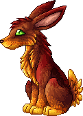
The wolf/dog looks very good technique-wise, not much I could critique there. The anatomy is a bit wonky (head too big, neck too thin) but I guess that is a question of drawing style.Piney wrote:Hi Munin. I made some sprites recently and any critique you can give me would help. :3
They're a bit bigger than your average sprite because those were the requested size. ^^;Spoiler
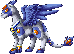
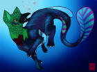
The CW is a bit too roughly shaded for my taste, some intermediate tones as well as careful (!) dithering would help. Also the highlight on the belly looks a bit dubious to me, I don´t think quite that much light would hit it and it looks a bit pillowshaded. The highlight at the back of the tail is also questionable as that would imply a second lightsource behind the CW. The anatomy is ok but the left (CW´s point of view) is turned a tad too far towards the viewer, I´d leave it to be seen more from the side as the way it is not looks pretty uncomfortable for the poor creature.
You definitely have quite some talent for spriting and should keep practicing =)
______________________________________________________________
Actually the length of the tail is about right now, just a really tiny bit longer than the original. The angle does not fit though, it is much higher and thus unbalances the dino. On the reference the tail does not go higher than the back, is mostly just horizontal and bends down at about two thirds of its length to the height of the point where the neck and body meet. It could also be a tad thicker at its base. Otherwise you should be good to start digitalizing it, just remember to rotate it so that it is properly horizontal first (might be just an effect in the photo you took though).ML1201 wrote:
thanks! I thought there might have been something wrong with the tail, but I wasn't sure. And thanks for the tip on the claw, my eye kept twitching because I couldn't seem to get it right!The eye I just put there are a general idea of where it should be, but I'll fix that as well before I stop being lazy and actually scan the drawing. And no, I totally spelled that wrong! And I had it right in front of me too!
__
okay, I made the changes as best as I could for what you mentioned, but now I think I made the tail a bit long.
Spoiler
reference:


________________________________________________________________________
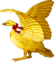
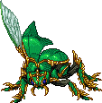
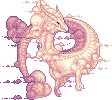
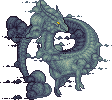
Thank you...I don´t know the next thing about Pokemon and could not for the life of me imagine what the bug critters were supposed to look like.SilverSun wrote: My late repy is EXTREMELY late. The bird:The bugs:Spoiler
Hope that helps, and yes they are Pokemon.Spoiler
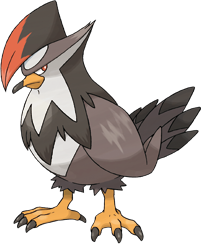


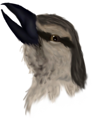
bird:
While it is great that you tried to give it a feather texture the whole thing gets terribly busy. You have lots of texture but no overall shading concept which makes it seem quite flat despite the texture. The tips of the feathers seem a bit blunt to me and the outlines are smeared and/or shaky in places. If you took the erasier tool and just cleaned that up and reshaped some detailes it would make the whole pic a lot clearer looking.
big bug:
On your painting it looks like it has fur on it´s body while the original creature looks like it has a carapace and mane.If that is right I´d suggest going for a smoother shading without separate lines and a more distinct highlight (because of the different materials and reflection properties). The mane on the other hand could be a bit fluffier with longer lines for the shading to suggest the direction and length of the strands to the viewer.
The direction/randomness of the flames looks good, I´d only blend the separate lines a bit better closer to their base.
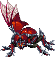
small bug:
It seems a bit ...superfluous to the composition of the pic. What is it doing there? Why is its back to the fight? Is it fleeing? (Not really asking but that is what comes to mind when I see it, so you should ask those questions for yourself when placing a critter)
It could use some more distinct shading as well.
Overall this is pretty good for a first attempt, so don´t let all the negative points I mentioned unsettle you, in the beginning everyone is bound to make mistakes and I have seen far, far worse first attempts ;)
Here are a few general things you should keep in mind:
- I cannot be sure but to me it looks like you shaded the whole thing using dodge and burn. Those tools are evil. Do not use them for shading. EVER. They don´t exist.
- Every picture needs a lightsource which you should define at the very beginning of the colouring process. It gives you an overall lighting concept which will in turn give your pic depth. Try to avoid having multiple lightsources or one that comes from the viewer unless it is a scene in a dark room and you want to give the impression of the scene being lith with a torch carried by the viewer
- Try to keep your outlines (all outlines of parts of the creature/object/etc) clean and clear, no smearing over it, no wobbly lines as those things will always distract the viewer
- Think about the composition of your pics. You did a great job of that with the bird and big bug fighting but be careful when placing more than two interacting critters in a pic that all of them have a function, even if it is just as a spectator.


