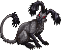
ML1201 wrote: I only did the tufts to show as an example, but I will do another with all the shading done that way as best I can. Afterwards I'll post it up. :3
Edit: Here's another one. I think I did better this time.
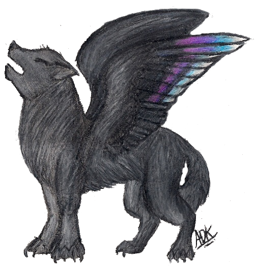
What graveperil did goes in the right direction, just the lighting needs to be a bit different...in that example the light comes directly from the viewer which is quite unusual... but the overall texture is what I meant, yes.graveperil wrote: I think what Munin is trying to say is that you need more fur texture. I went ahead and used your outline and did a sprite type (pixelized) version so you could zoom in and see the color differences. Keep in mind that this was done quickly and is by no means perfect. Like if I had more time, I would add better texture down the middle.. but I was just doing a down and dirty version for ya
_______________________________________________
Mhm, so far it looks good but very pale. If you did a stormy ocean around it it wood look ghostly as stormy water tends to be quite dark...not sure whether that´s what you were going for. A stormy sea would definitely fit the dynamic pose though. Generally the fact that it is all on one layer makes adding a background much, much more difficult because you´ll have to paint around the creature...next time at least use a transparent background to avoid that problem.Kael wrote:Here's a digital 'painting' I've been working on recently. It really just started out as a sketch, but then I started adding more to it until I realized I didn't know how to continue
I've tried looking for some water/ocean tutorials, but I didn't find one that really helped. I'm thinking of going for a stormy ocean, but I'm not sure ^^; And it's..uhh...all on one layer.Spoiler
To prevent me from rambling, I'll just say that I was just wondering if it looks good so far and if you had any advice on how to do the water, thanks

I cannot give you a real explanation on how to paint the water just now I am afraid...I´d need to paint an example for that and the earliest I will have time for something like that will be next Friday. =/
All in all it looks very good so far though but a bit more contrast (more dark tones) would help with the ghostly appearance. The head could use a tad more differentiation, it is very sleek right now and shows little underlying bone structure which I would expect to be visible with all those spikes protuding from the skull.
_______________________________________________
Ok, I´ll stick to more general things rather than critiquing the actual image then.wolfeyedangel wrote:I'm always looking for suggestions on improving my art so here's one for you.
First a caveat: This is a finished piece rather than a work in progress. I am looking for a critique with an eye to the next piece rather than suggestions for this one. Beyond (maybe) touching up the tear ducts and a few details around the eye, nothing's changing on this one.
It is rather large so Here's a link to the gallery it is currently at. (It should be entitled "Alleyna" with username Ambermoore there. Occasionally their gallery will 'offset' if so I can upload it somewhere else. I just haven't gotten it up in completed form on my deviant art account.)
http://www.runtimedna.com/gallery/displ ... pos=-44948
~Wolf
First of all, the pic could use more contrast. I am not sure if that is an effect of digitalizing it but most of it is in the medium range of the scale between pure black and pure white. If you use the whole range a picture will have more depth and be more life-like.
You put quite a bit of effort in the hair, there is a lot of structure there that draws the eye away from the face which looks flat and "uninteresting" in comparison.
Try to create less texture on areas like the face/skin, it is a bit confusing/distracting to have lines where they do not have a "function" while you have them in the hair to show the texture.
Even if you do a complex texture like the hair in this pic keep the overall shading in mind. Each strand is beautifully shaded and textured but the shading is the same regardless of the position in relation to the lightsource of the picture.
I hope this is the kind of pointers you were looking for, if I understood something wrong please let me know.
_______________________________________________
They look very good. You almost used too many colours though, it is hard to discern some of them from each other and using 18 colours for a sphere that small seems a bit... unnecessary. Spriting is always a balance between creating smooth transitions and keeping the number of colours as low as possible.pearlevil wrote:Hey Munin, I made these while looking at 1st part of "Basic Techniques" in your tutorial, how do they look?
First one I made.
The second one I made.
Also, I included the pallate of all the colors I used, the very last color on the pallates are the outlines' color.
_______________________________________________
Metakit and Bluestar21, I hope you don´t mind but I´ll reply to you two tomorrow or the day after, I unfortunately do not have more time right now and don´t want to rush your critiques.