Clicky!
Yay! I shall send the trade
Moderator: Hall of the Arts Moderators

 ~Kentiri is my keep guardian~


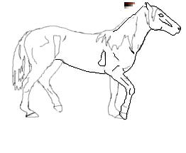
You should fix your sketch first. Right now the body is kind of overly long and the legs seem a bit short in relation to that. Also the legs are not on the same plane, the front legs are lower than the backlegs, like it is walking down a slope. I would further recommend not to start with so big a sprite, that´s way harder than a small one with say 140 px maximum length.kissxmexwell06 wrote:Hey munin its me again... I redid the lines of my horse like you said but i need help again.. maybe you can help with the neck ?
No worries and thanks for the link, I´ve started doing a sketch already and will probably send it to you once it´s done before I start spriting so that you can tell me if I got everything right.K4swap wrote:Sorry about that Munin! Here's a link for Photobucket!
Clicky!
Yay! I shall send the trade
There is a definite improvement between the first piece and the other two.Moonstonemarauder wrote:I was wondering if you could offer critique on three of my pieces.
Thank you so muchSpoiler
This one is older than the other two and and it looks really off.
http://i1199.photobucket.com/albums/aa4 ... -Edit1.png
http://i1199.photobucket.com/albums/aa4 ... nCub-1.jpg
http://i1199.photobucket.com/albums/aa4 ... thMist.jpg


Thank you so much! 8)Munin wrote:Spoiler
There is a definite improvement between the first piece and the other two.
Generally you should try avoiding an overuse of the blur tool though, it is great for creating a base for colouring but the final step should give your pics a bit more definition. I´ve got step-by-step thing in the first post of this thread which might give you a better idea what I man (the anthro-unicorn one).
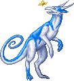
bird:
As you already noticed, this looks way off. The anatomy is rather wonky and the feathers of the wings don´t really make sense. The lines are very thick and rough, sometimes blurred together with the colouring. The colouring often goes out of your lines and the shading does not show a clear lightsource.
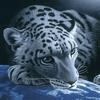
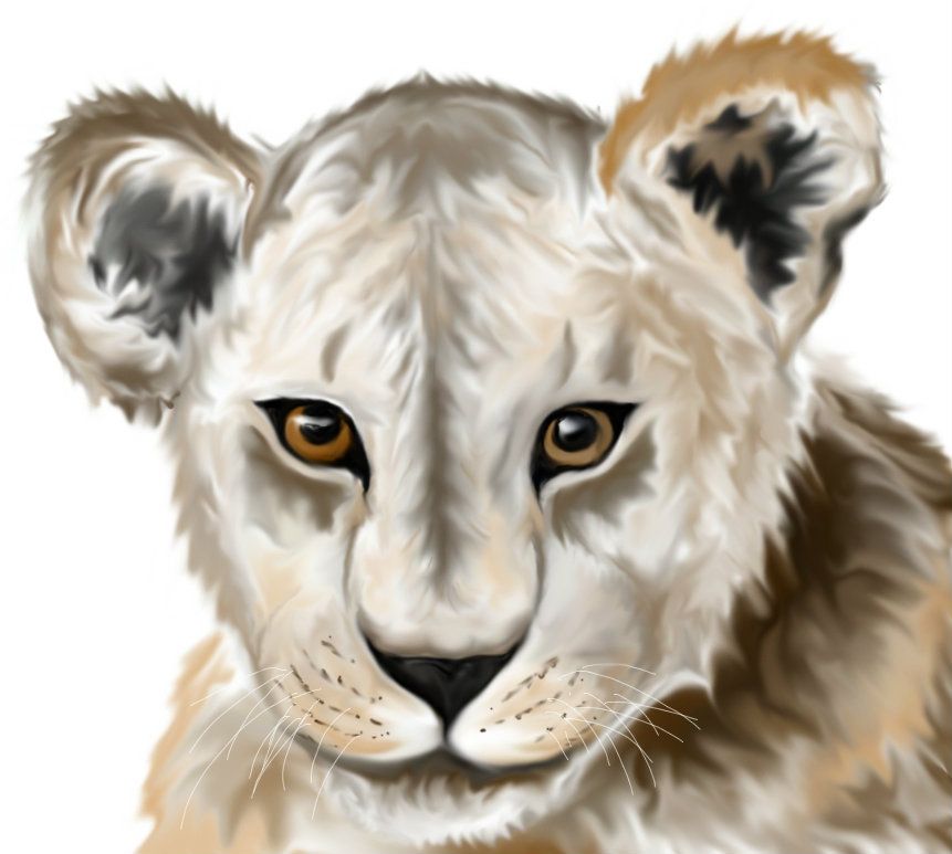
lion:
This is way better than your bird. The anatomy and proportions are correct and the colouring looks much cleaner. While it is still only barely noticeable in the face itself you´ve got a lightsource, shown in the dark shadow to the right of the head. You could try to work that in on the face itself somewhat more though.
The eyes and nose are well defined and give the viewer´s eye something to hold onto. A bit more definition would be great though, especially on the muzzle/"lips". The layers of fur kind of blur into each other which is especially noticeable on the ears and where the head is in front of the body. This is where the "last defining step" I mentioned in the general comment would come in, by putting in a few clear and defined lines establishing that one layer of fur is actually in front of the other.
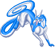
miststalker:
Here mostly the same things apply as with the lion. You´ve got a few very well defined things, like the eyes and horns but the rest kind of blurs together. I know that is due to the effect of the mist stalker fading into mist in places, especially on the legs but it would look better if the back and head were solid.
A bit more contrast (mainly going to darker colours for the shadows) would help with definition.
The near front paw looks a little awkward as it does not really seems to be resting on flat ground even though some weight is put onto it.
All in all you´re on a very good way, you have really improved already and you have a good grasp of lighting and anatomy already so keep practicing!


